| | What Art Got It Right? |  |
|
+6Duskweaver Felorn Gloryaxe Admin cavalier973 CHIA doctorbadwolf 10 posters |
| Author | Message |
|---|
doctorbadwolf
Heroic Adventurer

Posts : 81
Join date : 2013-05-25
| | Subject: What Art Got It Right? Thu Jun 13, 2013 6:32 am | |
| So, these threads were really fun, back when Astrids was around on the official boards.
What art, especially in 4e, but also in older editions and any Next concept art, managed to be cool, evocotive, and not annoy you in it's representation of peoples.
Also, what qualities make you happy with fantasy art? Feel free to discuss this in terms of gender, ethnicity or whatever else matters to you. Just let's try not to get all aggro with each other over it, ok? Doesn't matter if you disagree. If you think someone is being too sensitive, ignore it, unless you can articulate it in a way that isn't offensive.
If you think someone's examples should be in the "this is terrible on a social issues level" bin, ignore it, unless you can articulate it in a way that won't be seen as a personal attack.
Let's not turn this into an argument thread, if we can help it.
I'll image dump tomorrow. It's late. | |
|
| | |
doctorbadwolf
Heroic Adventurer
Posts : 81
Join date : 2013-05-25
| |
| | |
CHIA
Heroic Adventurer

Posts : 131
Join date : 2013-05-16
Age : 27
Location : Newark, DE
| | Subject: Re: What Art Got It Right? Wed Jul 24, 2013 7:00 pm | |
| The art from the chapter pages of the PHB1 was my favorite of all. Especially the one with the white dragon. | |
|
| | |
doctorbadwolf
Heroic Adventurer
Posts : 81
Join date : 2013-05-25
| | Subject: Re: What Art Got It Right? Fri Jul 26, 2013 12:51 pm | |
| | |
|
| | |
cavalier973
0th-Level Adventurer


Posts : 38
Join date : 2013-08-02
| | Subject: Re: What Art Got It Right? Fri Aug 02, 2013 8:49 pm | |
| There's a picture, I'm not sure which of the books it was in (maybe Adventurers' Vault 2) that had two members of an adventuring party leaning over a map and shouting at each other, while the other members in the party are looking uncomfortable (except for the Eladrin, standing off to himself, holding a glass of wine and looking amused). I also really like the updated Red Box image (found on the Player's Book in the 4e Red Box Starter Kit). - Image:
| |
|
| | |
cavalier973
0th-Level Adventurer
Posts : 38
Join date : 2013-08-02
| | Subject: Re: What Art Got It Right? Fri Aug 02, 2013 9:03 pm | |
| One of my favorite older pieces of art: - Image:
I can't figure out how to resize the pictures down; sorry about that. | |
|
| | |
Admin
Admin


Posts : 64
Join date : 2013-05-16
Character sheet
Name: Admin
Class: Admin
Race: Immortal Astral Being
| | Subject: Re: What Art Got It Right? Sat Aug 03, 2013 1:04 am | |
| No worries. I fixed it.  Instead of re-sizing pictures you can put them in spoiler boxes. | |
|
| | |
Felorn Gloryaxe
Epic Adventurer


Posts : 367
Join date : 2013-05-16
Location : United States
Character sheet
Name: Felorn Gloryaxe
Class: Fighter
Race: Dwarf
| | Subject: Re: What Art Got It Right? Mon Aug 26, 2013 6:06 pm | |
| I'm really digging some of the 13th Age art I'm seeing. A lot of it reminds me of 3e style "sketch" art. Like this: - Spoiler:
| |
|
| | |
cavalier973
0th-Level Adventurer
Posts : 38
Join date : 2013-08-02
| | Subject: Re: What Art Got It Right? Mon Aug 26, 2013 6:14 pm | |
| Here's the picture I was talking about in the earlier post (it's in the Rules Compendium): - Spoiler:
| |
|
| | |
Felorn Gloryaxe
Epic Adventurer
Posts : 367
Join date : 2013-05-16
Location : United States
Character sheet
Name: Felorn Gloryaxe
Class: Fighter
Race: Dwarf
| | Subject: Re: What Art Got It Right? Mon Aug 26, 2013 6:19 pm | |
| I also like that piece. And is it just me or does the human male look like James Wyatt? - James Wyatt:
| |
|
| | |
Duskweaver
0th-Level Adventurer

Posts : 64
Join date : 2013-06-14
Age : 42
Location : Et In Arcadia Ego
Character sheet
Name: Duskweaver
Class: Invoker
Race: Eladrin
| | Subject: Re: What Art Got It Right? Tue Aug 27, 2013 4:31 am | |
| I love how the elf in the background is all "These guys? No, I'm not with them. Never set eyes on them in my life before. Truly. Another glass? Don't mind if I do."
I also just noticed the dwarf is actually trying to climb over the table.
IIRC, there's a demotivator out there somewhere that uses that pic as a metaphor for the WotC forums. | |
|
| | |
Galstaff
Wannabe Adventurer


Posts : 17
Join date : 2014-01-11
Location : Barely Southern US
Character sheet
Name:
Class:
Race:
| | Subject: Re: What Art Got It Right? Sun Jan 12, 2014 9:55 pm | |
| Hey, the Chapter 1 opening art of the 4E PHB1 is actually pretty good, and oft-overlooked since the chapter is mostly for people completely unfamiliar with D&D. - That Art:
| |
|
| | |
Felorn Gloryaxe
Epic Adventurer
Posts : 367
Join date : 2013-05-16
Location : United States
Character sheet
Name: Felorn Gloryaxe
Class: Fighter
Race: Dwarf
| | Subject: Re: What Art Got It Right? Thu Mar 20, 2014 4:42 pm | |
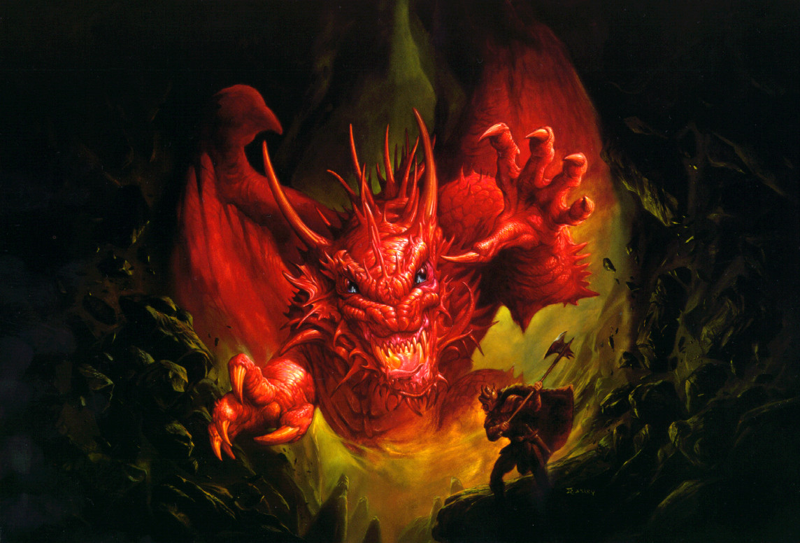
| I seen this today and though it just looked awesome. And I don't even personally like Tieflings. - Spoiler:
| |
|
| | |
Vaegard
Wannabe Adventurer
Posts : 4
Join date : 2014-04-14
| | Subject: Re: What Art Got It Right? Mon Apr 14, 2014 9:45 pm | |
| I personally think when it comes to 4E some of the art is GOOD...alot of it is DECENT...and some of it is mediocre at best, HOWEVER....3e art is utterly laughable imo and a prime example of amature shit that has sadly flooded the majority of the fantasy/comic/gaming media over the last 10 years or so.
For me ( and I want to clarify here I am NOT missing chainmail bikinis or lame concepts from this era ) fantasy art and fantasy rpg art will always be along the lines of: Brom, Parkinson, Easley, Elmore and Caldwell etc. I would in fact say alot of the art for 4E reminds me of the "late 90s end days" of TSR when they started hiring some questionable "filler but professional" type artists, I say this because while some of those artists were ok, they were nowhere near as good in terms of distinct style and technique that those master artists all had.
Now yes yes people will claim art is in the eye of the beholder, well to a degree there is some truth to this yes, but when we are talking about a professional product that is known worldwide that USED to have some truly atmospheric and quality fine traditional art that for many of us ( myself included ) brought alot of our imaginations to life and helped form visuals for us in the 80s and 90s, WOTC art today is simply not up to par and its a shadow of its former self, again I won't say 4e is bad I tolerate it and even like some of it, but it's clear for whatever reason the art gods that D&D used to have are no more.
I think they have got alot of the monster art correct for 4E, I think many of the landscape shots are also pretty decent even good...the characters and action scenes not so much outside of some rare examples in random books.
This is all coming from someone who is a professional artist of course who works with pencil, ink, watercolor, oil and pastels. The reality is and I know alot of people today are not part of this mindset, but when it comes to art schools, local art stores and even galleries...the emphasis today is to applaud the mediocre, those without any real art talent or for those who can truly manifest some works that speak to us.
I will try to keep this as short as possible but, when you strip down the typical digital deviant art fan shit we see time and again ( and that kind of stagnant design should speak volumes alone ) you end up with some truly rare top end artists, similar to how we had the comic kings in the 90s who all went off to form Image after they pissed on marvel for marvel pissing on them. The kinds of artists who thrived and were all over the place in the 70s and 80s and 90s were for the most part "older dudes" and would have grown up with more hands on art design and less focus on disgusting vomit canvas uninspired shit that is all over the world today and creating garbage dump eyesores.
The days of being taught mouth to ear and actually having a quality art teacher to push you to do art that is PART of you and comes from you, are rare today and that is a sad thing because far too many students who actually have talent are told both in highschool and uni that "you should do this because this is popular" and whats happens through this is that those artists eventually become a one trick pony cookie cutter type individual who never break the mold but simply add to a growing one of sterility.
| |
|
| | |
Felorn Gloryaxe
Epic Adventurer
Posts : 367
Join date : 2013-05-16
Location : United States
Character sheet
Name: Felorn Gloryaxe
Class: Fighter
Race: Dwarf
| | Subject: Re: What Art Got It Right? Tue Apr 15, 2014 2:19 pm | |
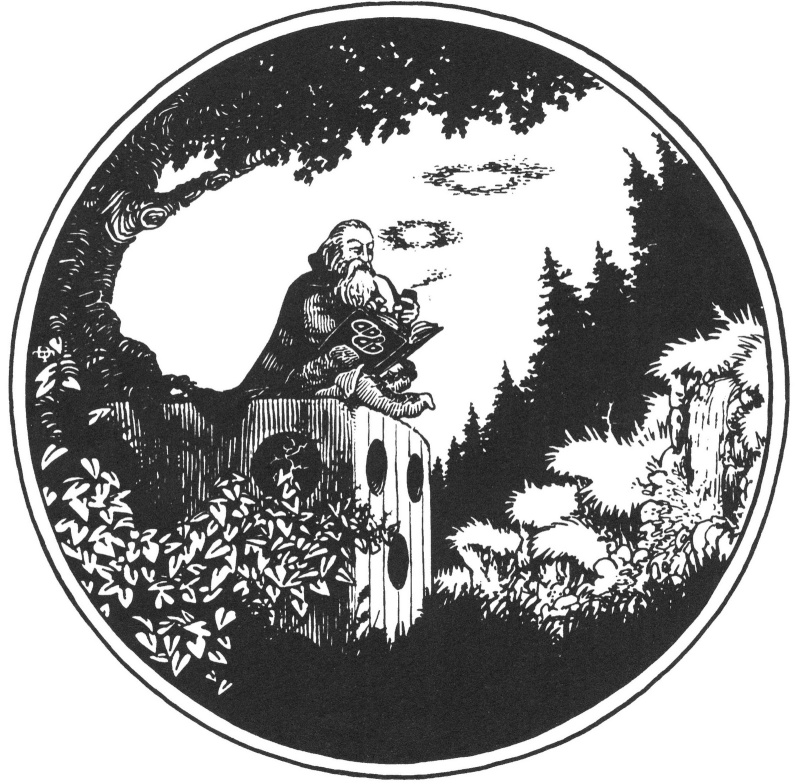
| I agree with most of what you said. Old school D&D art did have a certain quality to it. It had soul. Some of my favorite D&D art pieces are the covers on the old boxed sets Moldvay/Cook, BECMI, etc. They just screamed D&D. Especially the piece from the front page of the 1e PHB: - Spoiler:
When I see this image I still see countless other possibilities in the game. Not just what they are trying to show in the picture. | |
|
| | |
Feedafeva
Wannabe Adventurer
Posts : 2
Join date : 2014-07-27
Location : Missouri
| | Subject: Re: What Art Got It Right? Thu Jul 31, 2014 7:29 pm | |
| I cut my teeth in the RPG world on 2E so I'm probably biased, but the late 80s to somewhat mid 90s still holds my favorite stuff. A lot of material produced in this time period is worth owning for the art alone. Oh to still have even a fraction of the RPG material from my junior high and high school days.
What stands head and shoulders above everything, personally, was DiTerlizzi's work on Planescape. I still remember opening the box and being enthralled with everything. The quick, sketchy style had so much personality I immediately knew my friends and I were going to have many wacky adventures.
We each DMed different settings, and while Ravenloft had it's mysteries and horror, Forgotten Realms had it's politics and intrigue, Dark Sun with it's you're dead roll up a new guy, Planescape was the place anything and everything could happen. The art went a long way on selling this idea in my head and to the rest of our group. This, to me, is the definitive version of the planes.
Also, Dark Sun just isn't Dark Sun without Brom art. | |
|
| | |
Felorn Gloryaxe
Epic Adventurer
Posts : 367
Join date : 2013-05-16
Location : United States
Character sheet
Name: Felorn Gloryaxe
Class: Fighter
Race: Dwarf
| | Subject: Re: What Art Got It Right? Mon Aug 04, 2014 1:09 pm | |
| DiTerlizzi... One of my favorite oldschool artists. His pieces just scream classic fantasy. They also have an Alice in Wonderland type feel if you get where I'm coming from. His characters are often depicted oddly. IMO http://diterlizzi.com/home/games-gallery/ | |
|
| | |
Durriken
Heroic Adventurer

Posts : 117
Join date : 2013-09-23
Location : Pittsburgh
Character sheet
Name: Durriken
Class: Disestablishmentarian
Race: Green dragon
| | Subject: Re: What Art Got It Right? Tue Aug 12, 2014 9:38 am | |
| This is something that I have been puzzling about in my head for a while... why would an edition need just one style of art, or why should one style be inherently better than another? I like the *most* of the art in BEMCI. Occasionally there would be something that looked like it was drawn by a grade schooler, but it was fine for the most part. I also like the art in 4e. The comic book style action stuff is great. Some stuff falls a little flat and seems like filler but still, for the most part great. 2e art was great too. No problems. Don't have any 3.x books, but I'm sure I would have no problems there either.
Mostly the art over the year has all been fine. My only complaints would be ridiculous armor and ridiculous weapons. In the armor department they seem to have abandoned the chainmail bikini, but you still see giant shoulder and elbow spikes. As far as weapons (4e was really bad in this area), someone needs to let them know that warhammers had small heads so they could focus energy in a small point and make a better dent in armor plates, not the giant mallet things you see so often. And swords with lots of little curvy and swishy bits... please, those would break off or get caught on things on first use and be a real disadvantage. Blades should a nice even continuous cutting surface - more durable and much easier to sharpen.
So yeah, classic art, comic book art, realistic art, color, black and white... I'm in. I'm even cartoony style funnies if you want to throw those in. Always enjoyed those in the old print Dragon magazines. They could have a place in books. Have a sense of humor about yourself.
TjD | |
|
| | |
Sponsored content
| | Subject: Re: What Art Got It Right? | |
| |
|
| | |
| | What Art Got It Right? | |
|

 Here we have two very different images that I think, in the context of character portraits, definitely both got it right. Both are powerful, and the one that's sexy isn't being objectified. Both tell the viewer to tread carefully around these characters. Either could be male, without any change in effect. (the second would be more different in clothing, with tight pants and loose fitting shirt or bare chest, probably, but that's it)